The TTC
Desktop Website Redesign
No items found.

about:
How to make the TTC Website more user-friendly? I think I found some lovely ideas here! College Project for the Experience Design Course.
My Role:
User Experience Designer
How to make the TTC Website more user-friendly? I think I found some lovely ideas here! College Project for the Experience Design Course.
User Experience Designer

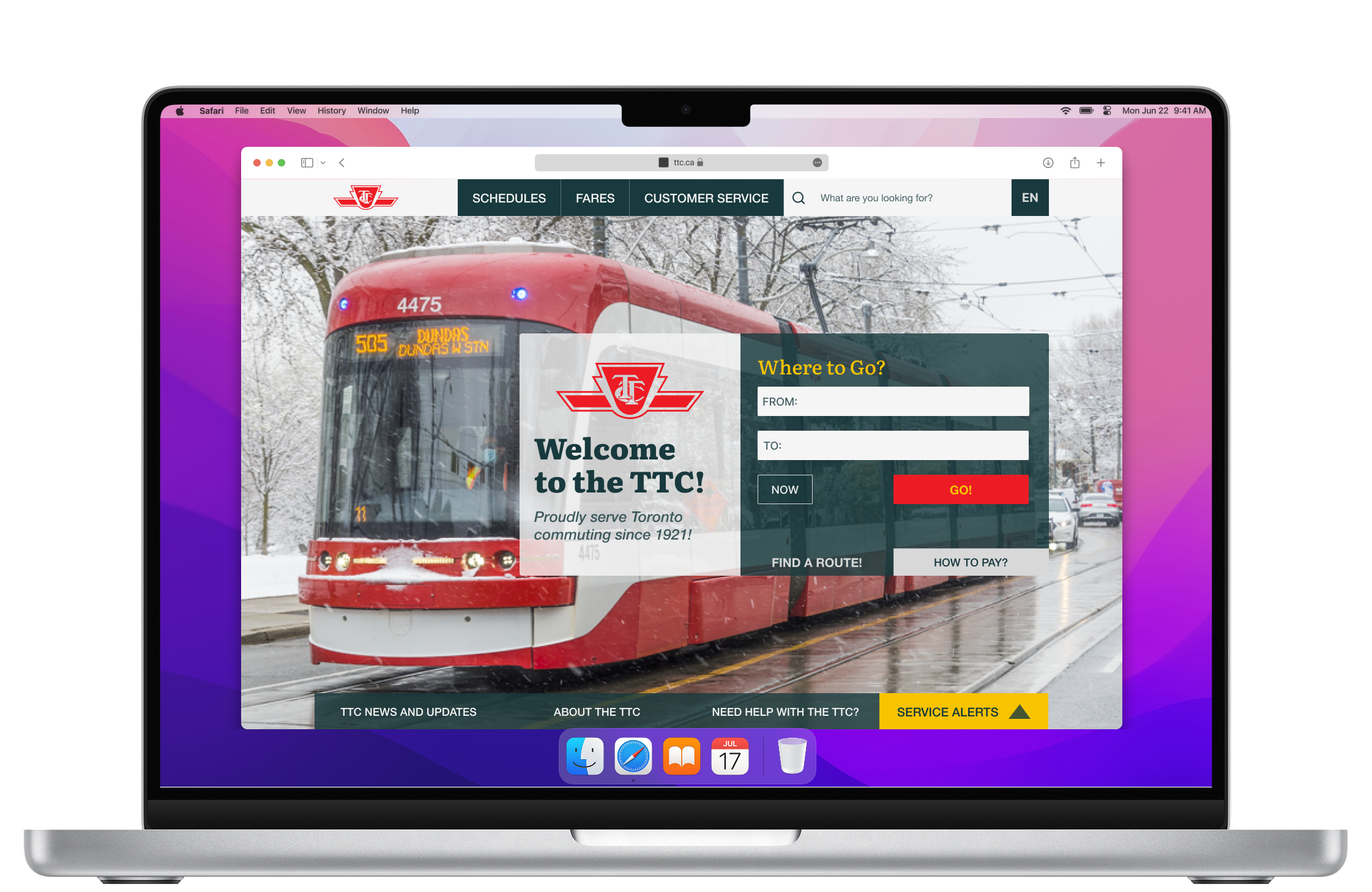
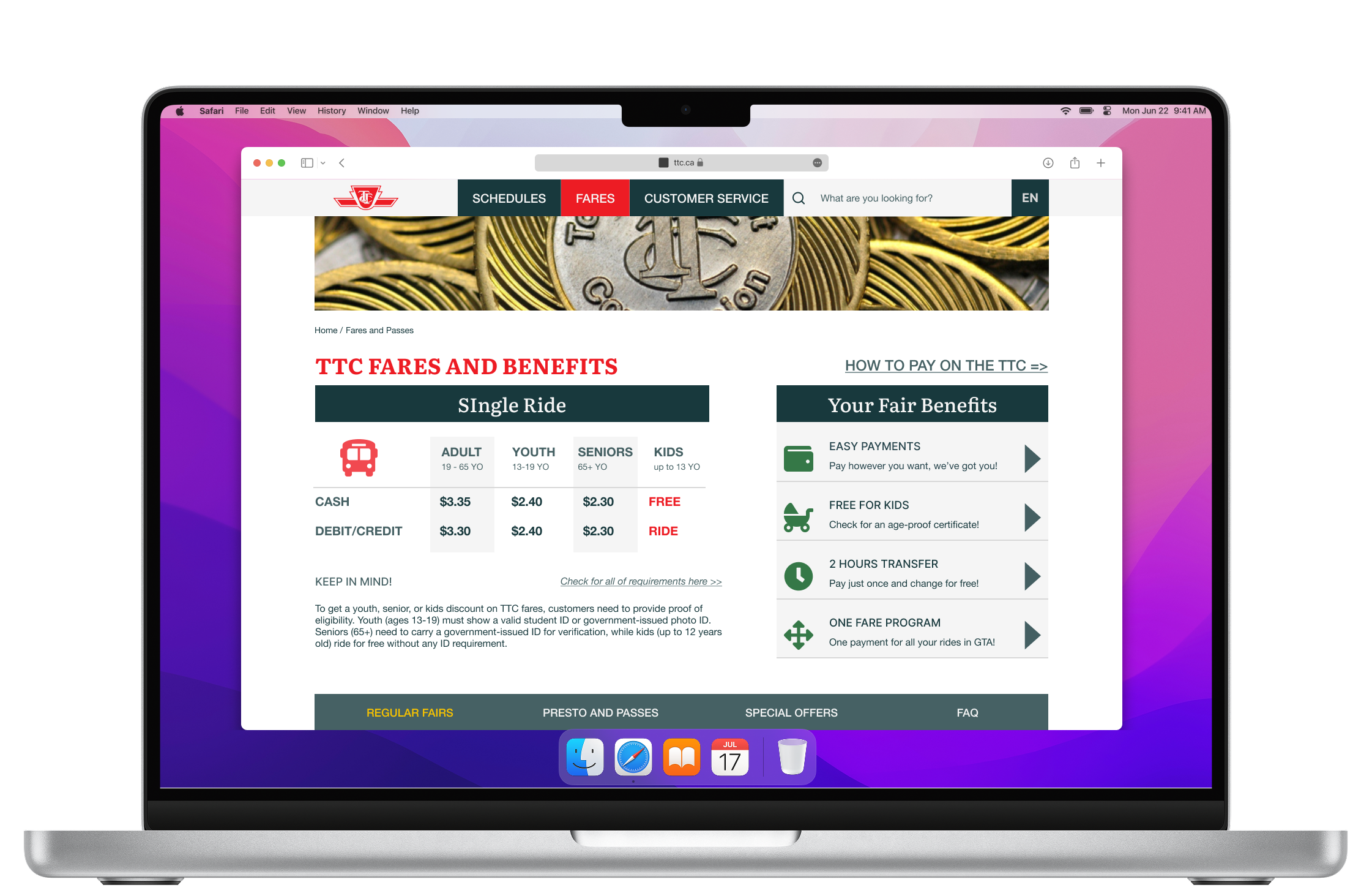
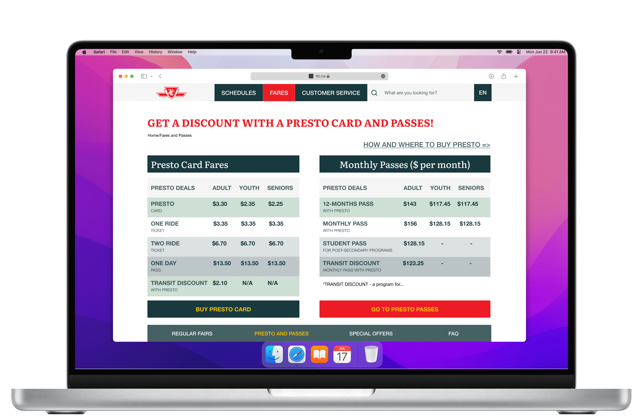
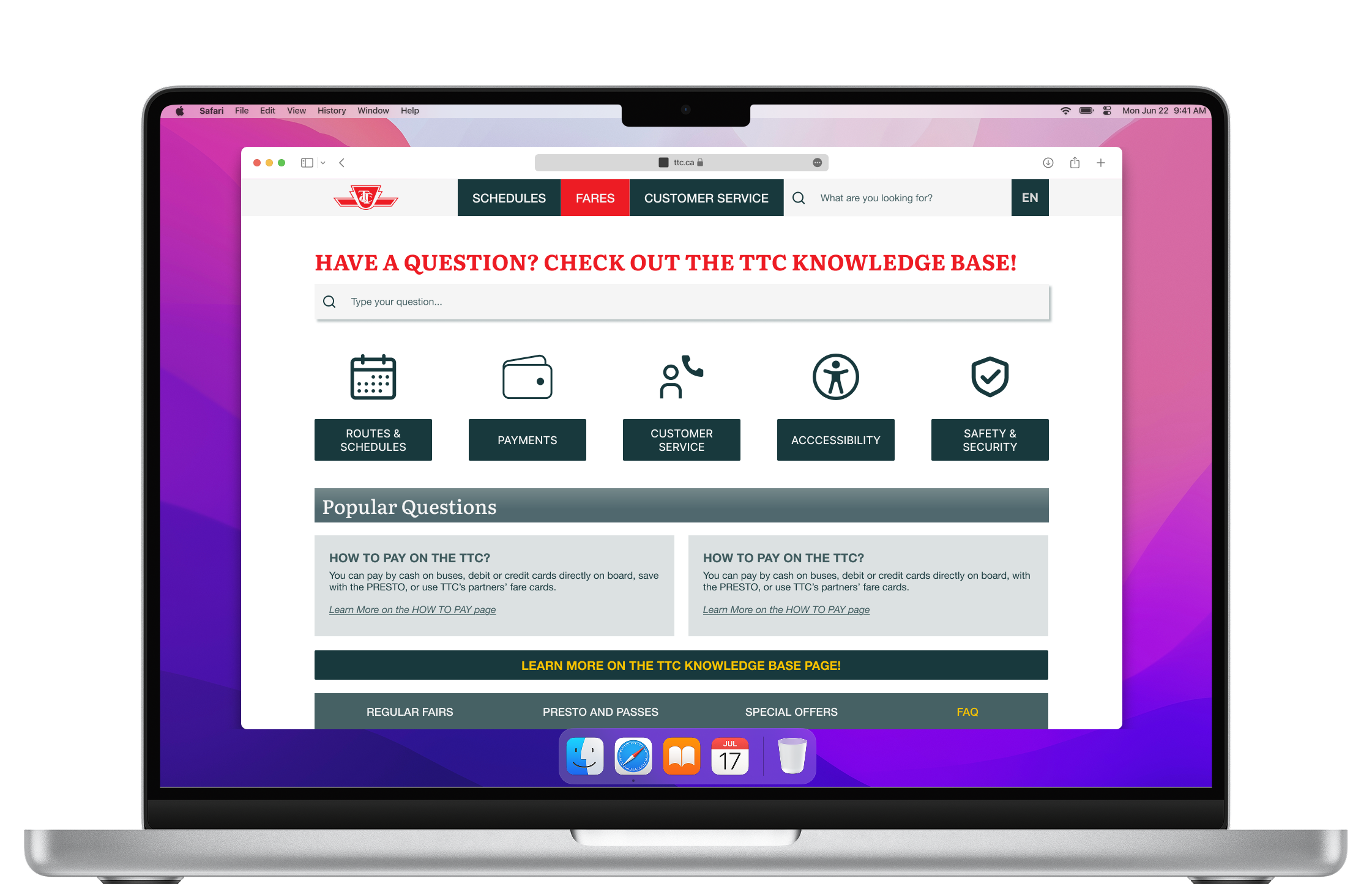
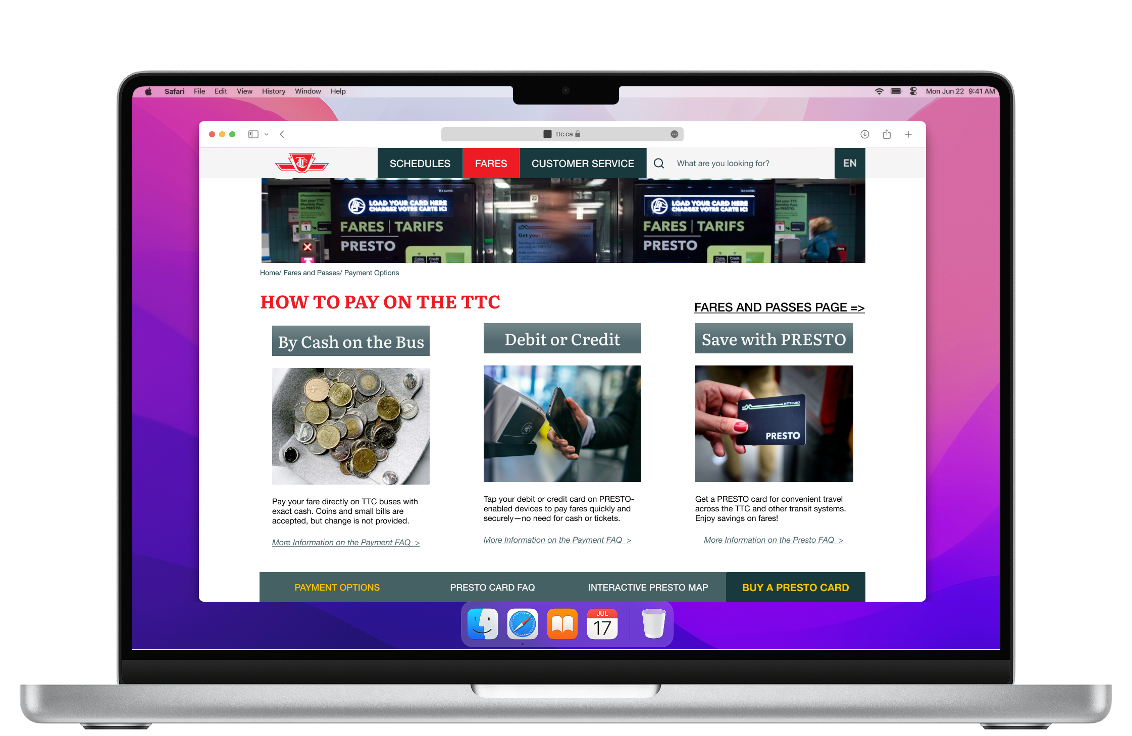
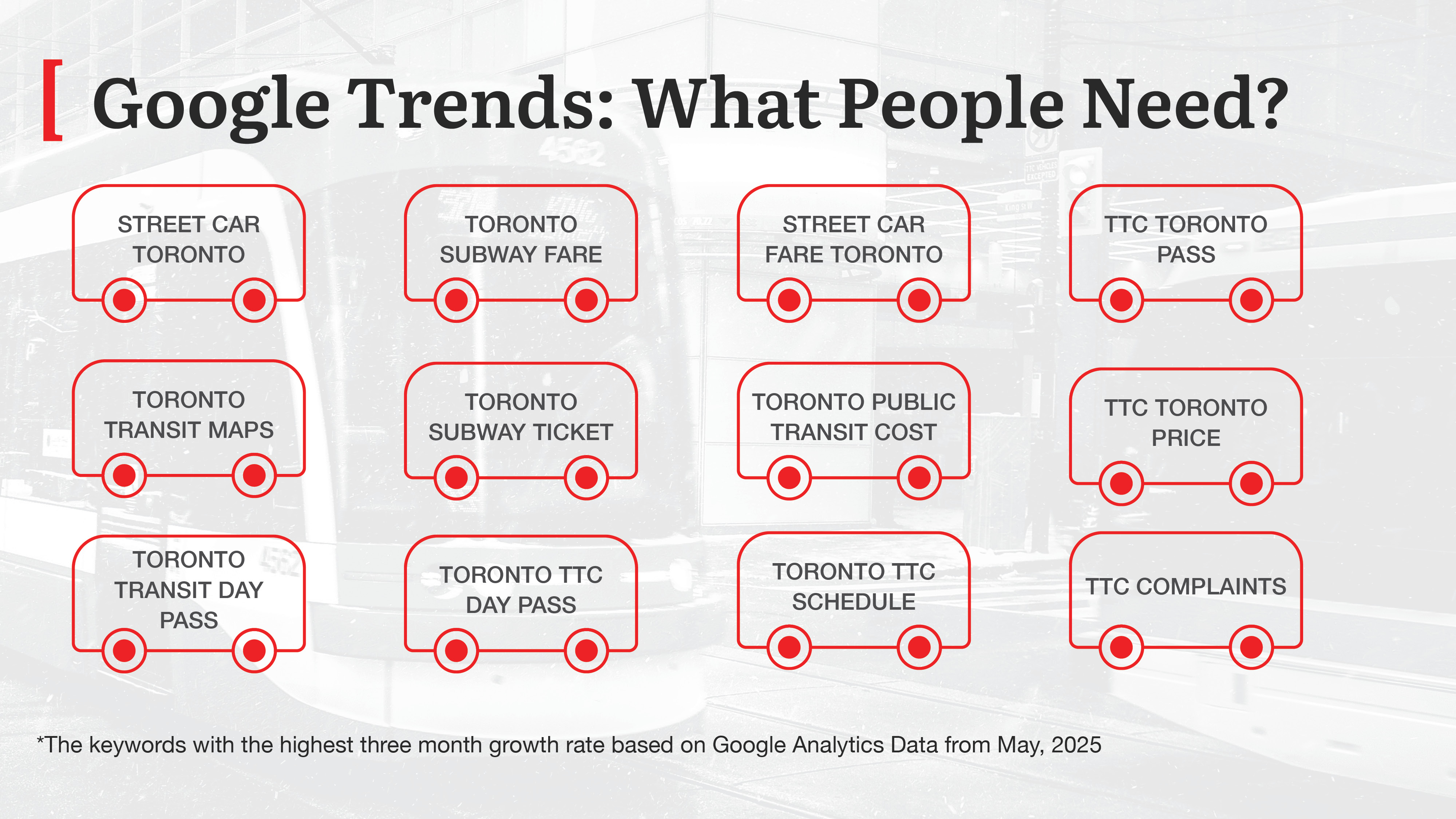
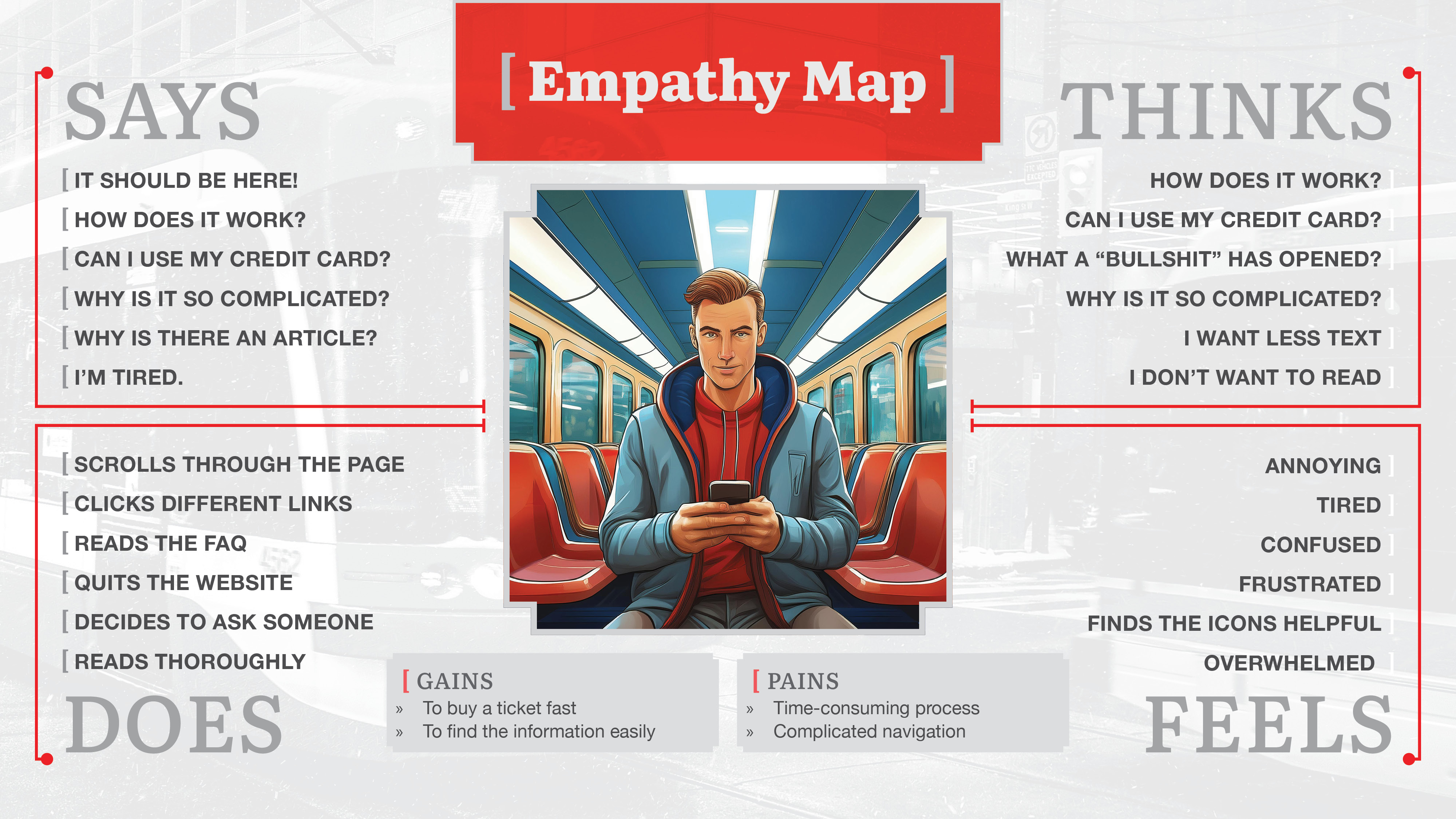
TTC is a vital service for many Torontonians and visitors to the city. It’s essential to have quick, easy access to all necessary information, whether a user has some experience with the TTC or is a complete newbie.
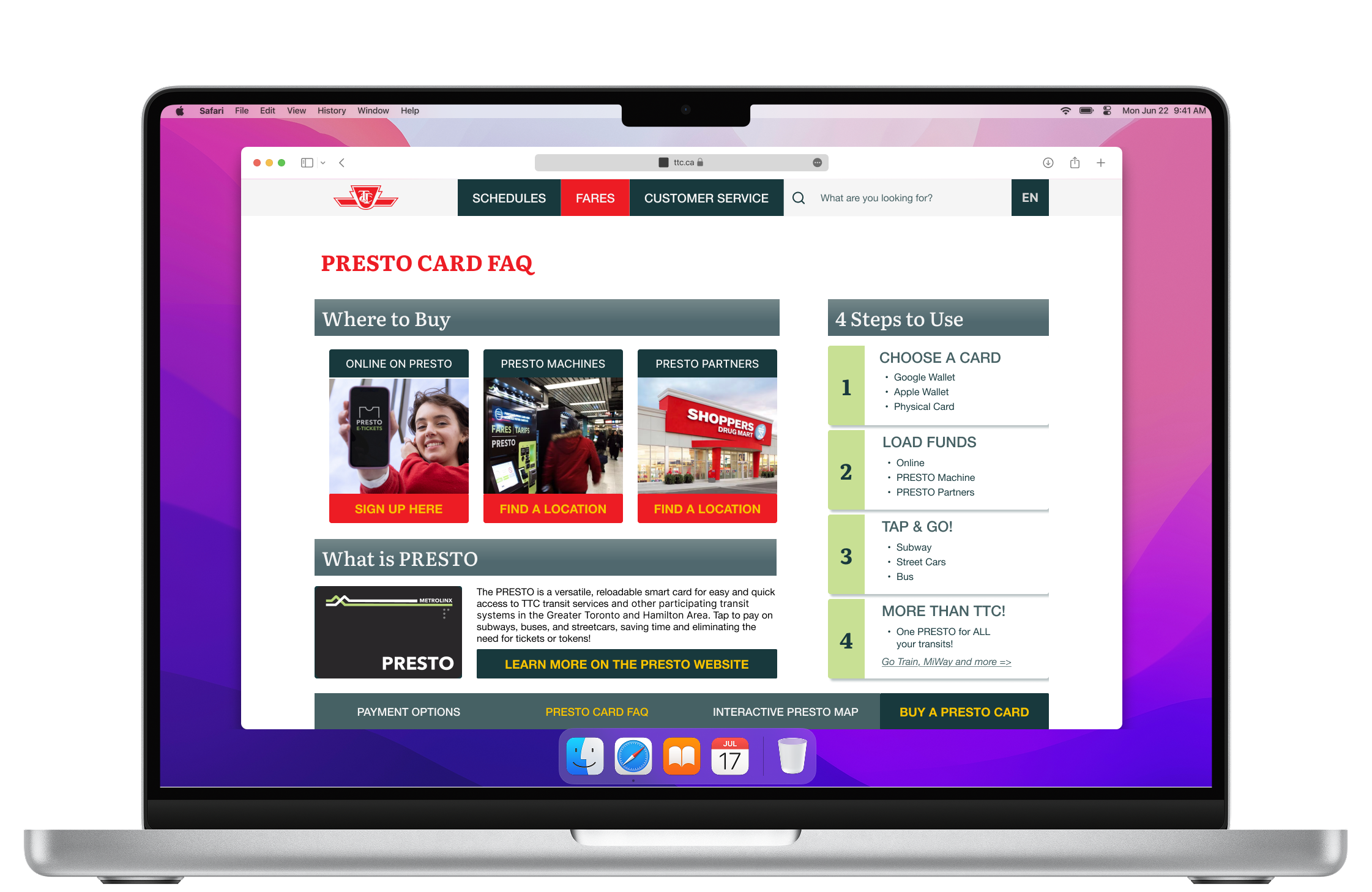
One of the issues with the website is the confusing way to buy a ticket or pass. Users are unable to do it directly from the official websites. The explanations are organized in text articles, and the links are confusing; for example, they don’t lead to the expected page.
A high-fidelity prototype design in Figma for the following User Journeys:


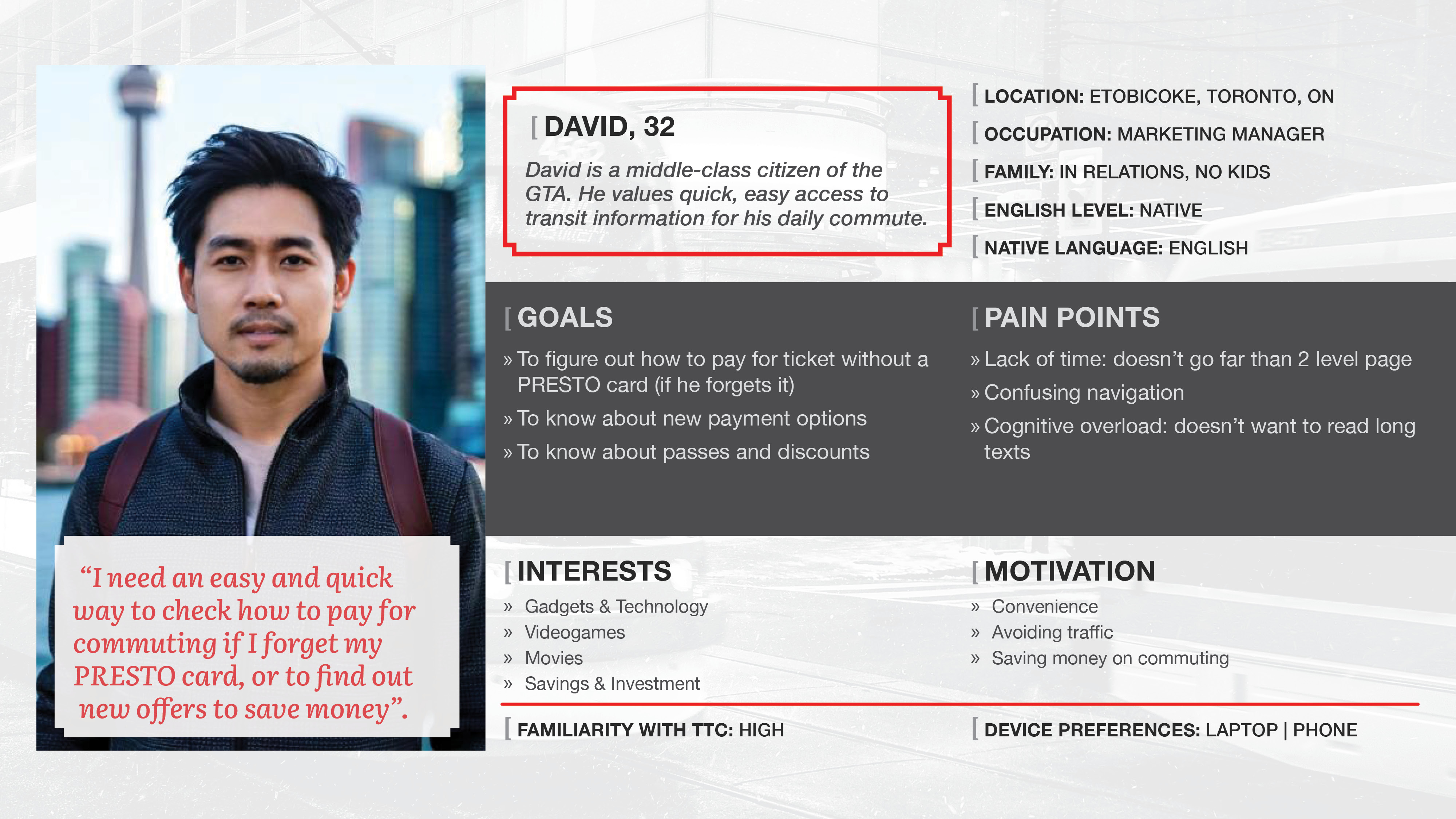

A TTC customer needs an easy and quick way to get information about payment options and the option to purchase a ticket or pass directly from the official website because they want to save time and reduce cognitive load.
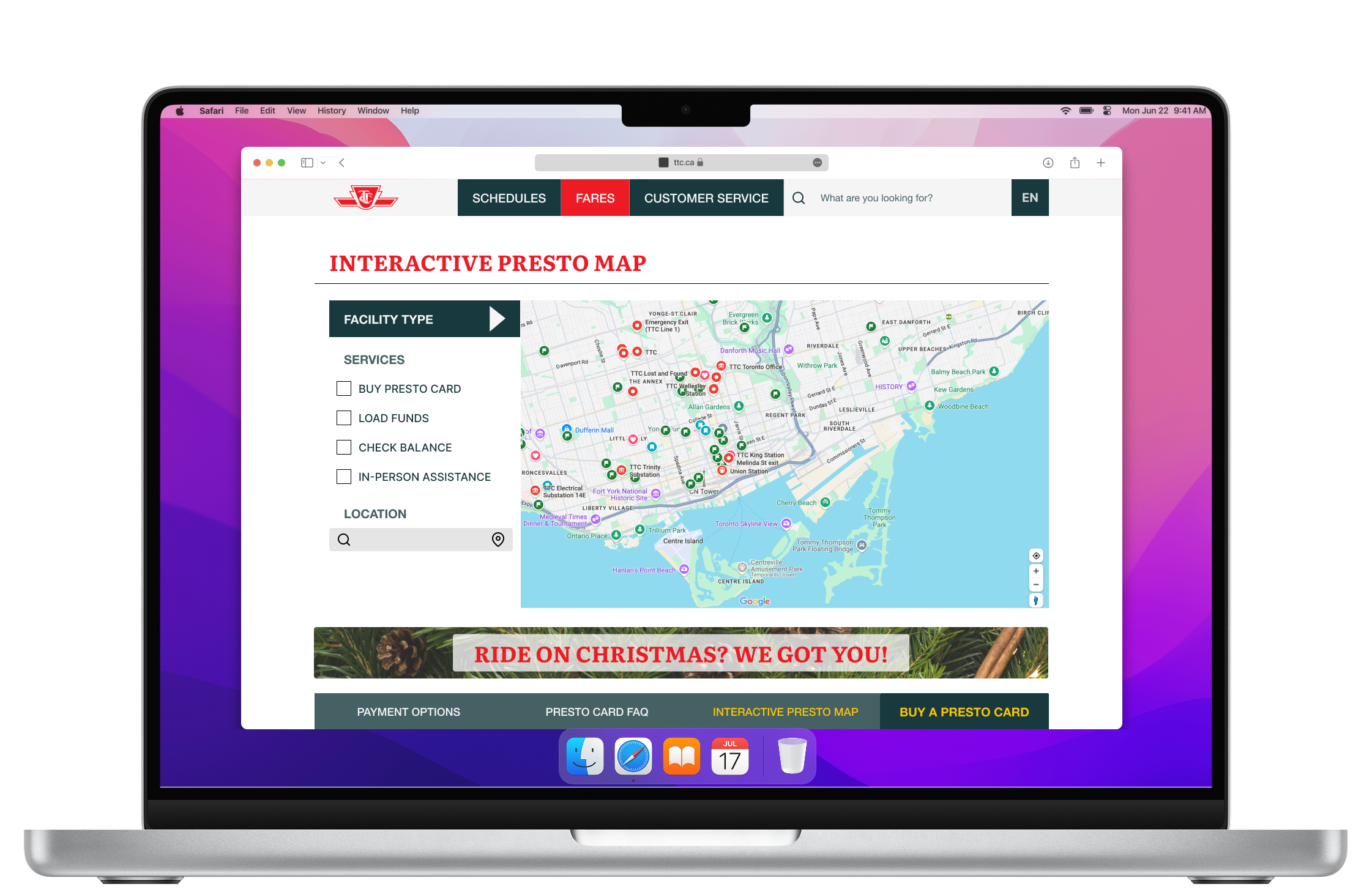
...users have access to fares information from different touchpoints: from the home page, from the navigation, and more detailed, from the delegated inner pages?
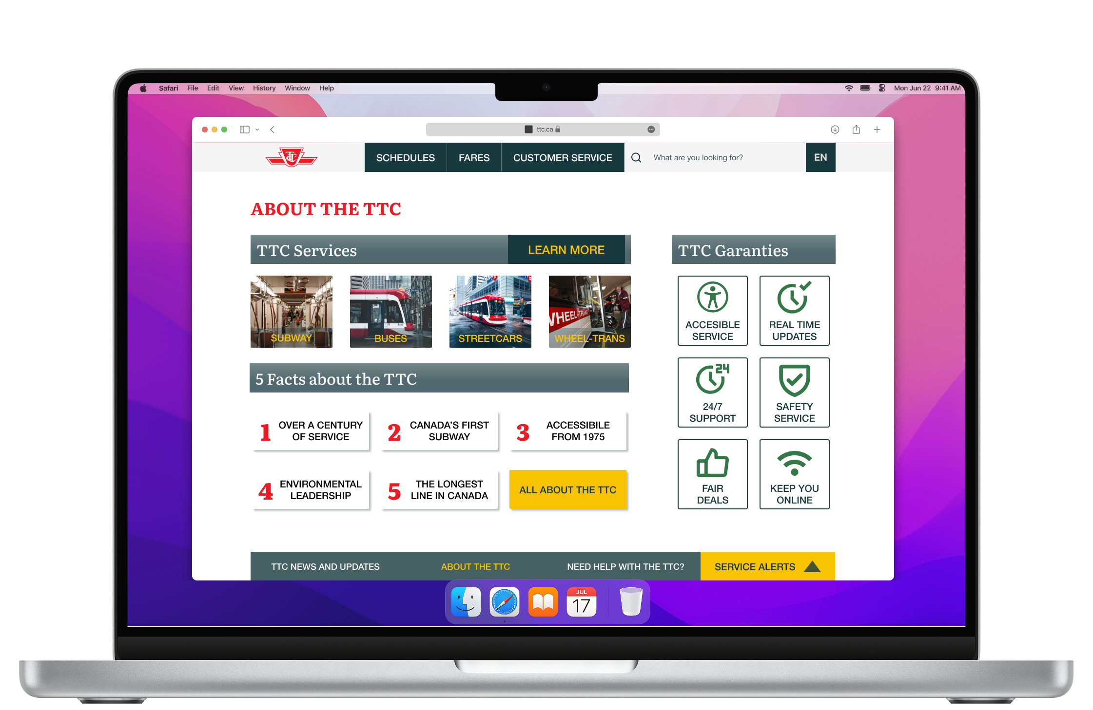
...we redesign formal-looking tables and make them look up-to-date?
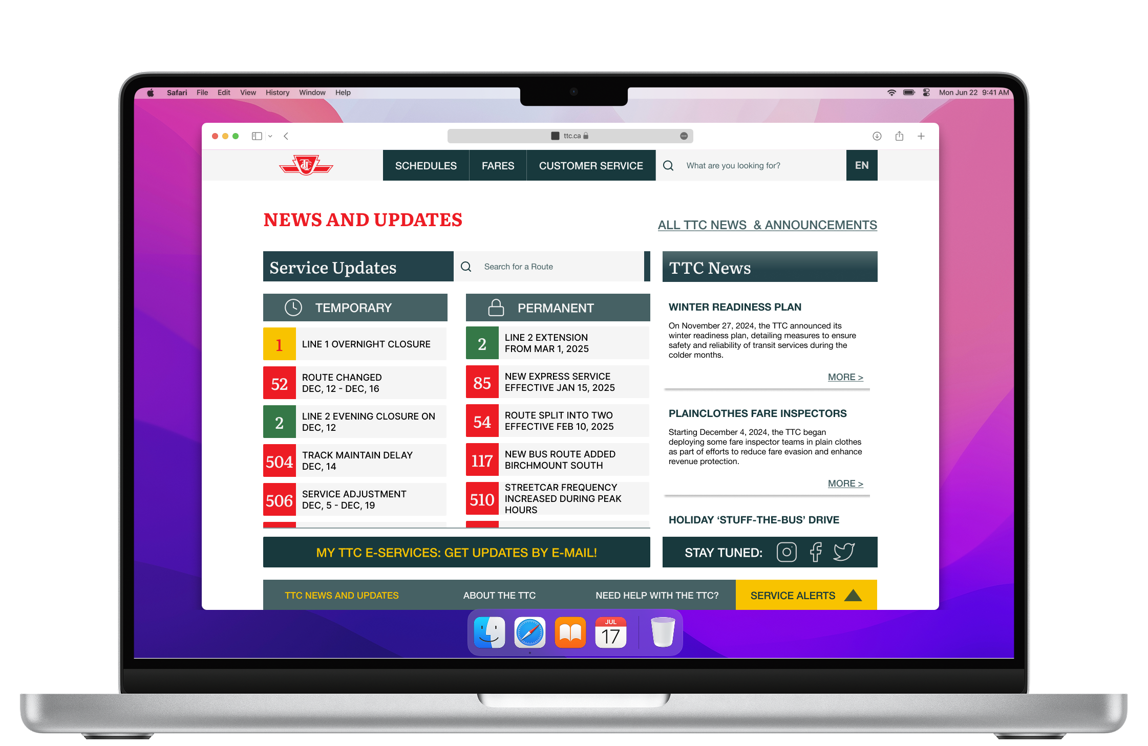
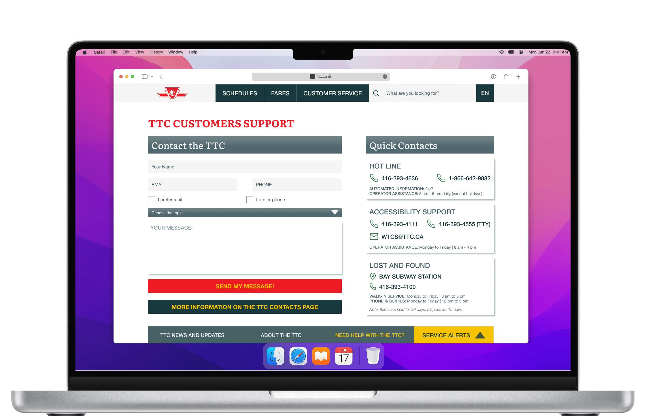
...we remove huge text blocks with dozens of links, and substitute them with visuals, bullet points, and interactive elements like a map?